Python PyQtGraphの公式サンプルを実行する方法を説明する。
結論
コンソール(Mac)/コマンドプロンプト(Windows)で
python -m pyqtgraph.examplesを実行する。

するとこのようなウィンドウが出現する。サンプルを実行するには、左の欄からサンプルを選び、左下のQt Libraryを選択し、Run Exampleをクリックする。

サンプルの中身
Command-line usage


"""
Display a plot and an image with minimal setup.

pg.plot() and pg.image() are indended to be used from an interactive prompt
to allow easy data inspection (but note that PySide unfortunately does not
call the Qt event loop while the interactive prompt is running, in this case
it is necessary to call QApplication.exec_() to make the windows appear).
"""

import numpy as np

import pyqtgraph as pg

data = np.random.normal(size=1000)
pg.plot(data, title="Simplest possible plotting example")

data = np.random.normal(size=(500,500))
pg.image(data, title="Simplest possible image example")

if __name__ == '__main__':
    pg.exec()
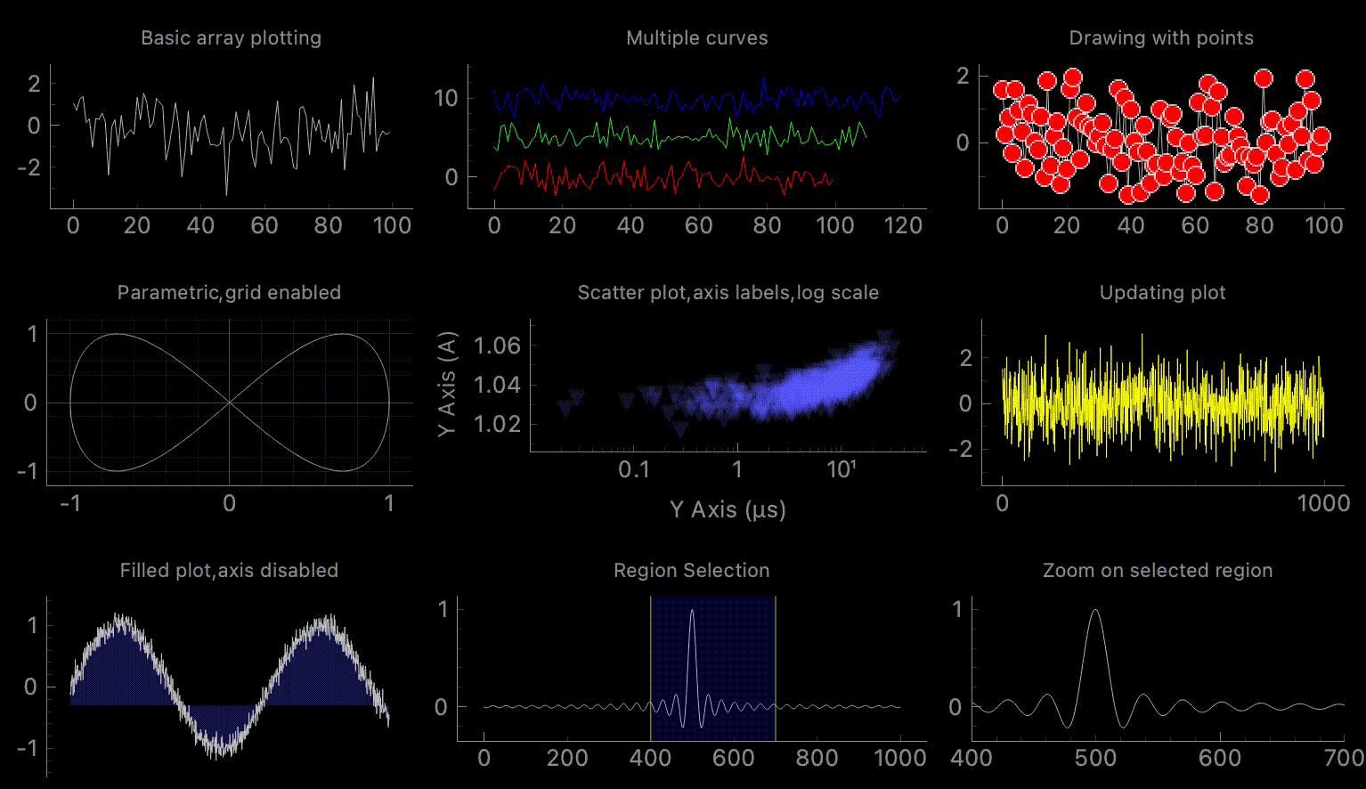
Basic Plotting

"""
This example demonstrates many of the 2D plotting capabilities
in pyqtgraph. All of the plots may be panned/scaled by dragging with
the left/right mouse buttons. Right click on any plot to show a context menu.
"""

import numpy as np

import pyqtgraph as pg
from pyqtgraph.Qt import QtCore

app = pg.mkQApp("Plotting Example")
#mw = QtWidgets.QMainWindow()
#mw.resize(800,800)

win = pg.GraphicsLayoutWidget(show=True, title="Basic plotting examples")
win.resize(1000,600)
win.setWindowTitle('pyqtgraph example: Plotting')

# Enable antialiasing for prettier plots
pg.setConfigOptions(antialias=True)

p1 = win.addPlot(title="Basic array plotting", y=np.random.normal(size=100))

p2 = win.addPlot(title="Multiple curves")
p2.plot(np.random.normal(size=100), pen=(255,0,0), name="Red curve")
p2.plot(np.random.normal(size=110)+5, pen=(0,255,0), name="Green curve")
p2.plot(np.random.normal(size=120)+10, pen=(0,0,255), name="Blue curve")

p3 = win.addPlot(title="Drawing with points")
p3.plot(np.random.normal(size=100), pen=(200,200,200), symbolBrush=(255,0,0), symbolPen='w')


win.nextRow()

p4 = win.addPlot(title="Parametric, grid enabled")
x = np.cos(np.linspace(0, 2*np.pi, 1000))
y = np.sin(np.linspace(0, 4*np.pi, 1000))
p4.plot(x, y)
p4.showGrid(x=True, y=True)

p5 = win.addPlot(title="Scatter plot, axis labels, log scale")
x = np.random.normal(size=1000) * 1e-5
y = x*1000 + 0.005 * np.random.normal(size=1000)
y -= y.min()-1.0
mask = x > 1e-15
x = x[mask]
y = y[mask]
p5.plot(x, y, pen=None, symbol='t', symbolPen=None, symbolSize=10, symbolBrush=(100, 100, 255, 50))
p5.setLabel('left', "Y Axis", units='A')
p5.setLabel('bottom', "Y Axis", units='s')
p5.setLogMode(x=True, y=False)

p6 = win.addPlot(title="Updating plot")
curve = p6.plot(pen='y')
data = np.random.normal(size=(10,1000))
ptr = 0
def update():
    global curve, data, ptr, p6
    curve.setData(data[ptr%10])
    if ptr == 0:
        p6.enableAutoRange('xy', False)  ## stop auto-scaling after the first data set is plotted
    ptr += 1
timer = QtCore.QTimer()
timer.timeout.connect(update)
timer.start(50)


win.nextRow()

p7 = win.addPlot(title="Filled plot, axis disabled")
y = np.sin(np.linspace(0, 10, 1000)) + np.random.normal(size=1000, scale=0.1)
p7.plot(y, fillLevel=-0.3, brush=(50,50,200,100))
p7.showAxis('bottom', False)


x2 = np.linspace(-100, 100, 1000)
data2 = np.sin(x2) / x2
p8 = win.addPlot(title="Region Selection")
p8.plot(data2, pen=(255,255,255,200))
lr = pg.LinearRegionItem([400,700])
lr.setZValue(-10)
p8.addItem(lr)

p9 = win.addPlot(title="Zoom on selected region")
p9.plot(data2)
def updatePlot():
    p9.setXRange(*lr.getRegion(), padding=0)
def updateRegion():
    lr.setRegion(p9.getViewBox().viewRange()[0])
lr.sigRegionChanged.connect(updatePlot)
p9.sigXRangeChanged.connect(updateRegion)
updatePlot()

if __name__ == '__main__':
    pg.exec()
ImageView

"""
This example demonstrates the use of ImageView with 3-color image stacks.
ImageView is a high-level widget for displaying and analyzing 2D and 3D data.
ImageView provides:

  1. A zoomable region (ViewBox) for displaying the image
  2. A combination histogram and gradient editor (HistogramLUTItem) for
     controlling the visual appearance of the image
  3. A timeline for selecting the currently displayed frame (for 3D data only).
  4. Tools for very basic analysis of image data (see ROI and Norm buttons)

"""

import numpy as np

import pyqtgraph as pg
from pyqtgraph.Qt import QtWidgets

# Interpret image data as row-major instead of col-major
pg.setConfigOptions(imageAxisOrder='row-major')

app = pg.mkQApp("ImageView Example")

## Create window with ImageView widget
win = QtWidgets.QMainWindow()
win.resize(800,800)
imv = pg.ImageView()
win.setCentralWidget(imv)
win.show()
win.setWindowTitle('pyqtgraph example: ImageView')

## Create random 3D data set with time varying signals
dataRed = np.ones((100, 200, 200)) * np.linspace(90, 150, 100)[:, np.newaxis, np.newaxis]
dataRed += pg.gaussianFilter(np.random.normal(size=(200, 200)), (5, 5)) * 100
dataGrn = np.ones((100, 200, 200)) * np.linspace(90, 180, 100)[:, np.newaxis, np.newaxis]
dataGrn += pg.gaussianFilter(np.random.normal(size=(200, 200)), (5, 5)) * 100
dataBlu = np.ones((100, 200, 200)) * np.linspace(180, 90, 100)[:, np.newaxis, np.newaxis]
dataBlu += pg.gaussianFilter(np.random.normal(size=(200, 200)), (5, 5)) * 100

data = np.concatenate(
    (dataRed[:, :, :, np.newaxis], dataGrn[:, :, :, np.newaxis], dataBlu[:, :, :, np.newaxis]), axis=3
)


## Display the data and assign each frame a time value from 1.0 to 3.0
imv.setImage(data, xvals=np.linspace(1., 3., data.shape[0]))

## Set a custom color map
colors = [
    (0, 0, 0),
    (45, 5, 61),
    (84, 42, 55),
    (150, 87, 60),
    (208, 171, 141),
    (255, 255, 255)
]
cmap = pg.ColorMap(pos=np.linspace(0.0, 1.0, 6), color=colors)
imv.setColorMap(cmap)

# Start up with an ROI
imv.ui.roiBtn.setChecked(True)
imv.roiClicked()

if __name__ == '__main__':
    pg.exec()
ParameterTree

"""
This example demonstrates the use of pyqtgraph's parametertree system. This provides
a simple way to generate user interfaces that control sets of parameters. The example
demonstrates a variety of different parameter types (int, float, list, etc.)
as well as some customized parameter types
"""

# `makeAllParamTypes` creates several parameters from a dictionary of config specs.
# This contains information about the options for each parameter so they can be directly
# inserted into the example parameter tree. To create your own parameters, simply follow
# the guidelines demonstrated by other parameters created here.
from _buildParamTypes import makeAllParamTypes

import pyqtgraph as pg
from pyqtgraph.Qt import QtWidgets

app = pg.mkQApp("Parameter Tree Example")
import pyqtgraph.parametertree.parameterTypes as pTypes
from pyqtgraph.parametertree import Parameter, ParameterTree


## test subclassing parameters
## This parameter automatically generates two child parameters which are always reciprocals of each other
class ComplexParameter(pTypes.GroupParameter):
    def __init__(self, **opts):
        opts['type'] = 'bool'
        opts['value'] = True
        pTypes.GroupParameter.__init__(self, **opts)

        self.addChild({'name': 'A = 1/B', 'type': 'float', 'value': 7, 'suffix': 'Hz', 'siPrefix': True})
        self.addChild({'name': 'B = 1/A', 'type': 'float', 'value': 1/7., 'suffix': 's', 'siPrefix': True})
        self.a = self.param('A = 1/B')
        self.b = self.param('B = 1/A')
        self.a.sigValueChanged.connect(self.aChanged)
        self.b.sigValueChanged.connect(self.bChanged)

    def aChanged(self):
        self.b.setValue(1.0 / self.a.value(), blockSignal=self.bChanged)

    def bChanged(self):
        self.a.setValue(1.0 / self.b.value(), blockSignal=self.aChanged)


## test add/remove
## this group includes a menu allowing the user to add new parameters into its child list
class ScalableGroup(pTypes.GroupParameter):
    def __init__(self, **opts):
        opts['type'] = 'group'
        opts['addText'] = "Add"
        opts['addList'] = ['str', 'float', 'int']
        pTypes.GroupParameter.__init__(self, **opts)

    def addNew(self, typ):
        val = {
            'str': '',
            'float': 0.0,
            'int': 0
        }[typ]
        self.addChild(dict(name="ScalableParam %d" % (len(self.childs)+1), type=typ, value=val, removable=True, renamable=True))


params = [
    makeAllParamTypes(),
    {'name': 'Save/Restore functionality', 'type': 'group', 'children': [
        {'name': 'Save State', 'type': 'action'},
        {'name': 'Restore State', 'type': 'action', 'children': [
            {'name': 'Add missing items', 'type': 'bool', 'value': True},
            {'name': 'Remove extra items', 'type': 'bool', 'value': True},
        ]},
    ]},
    {'name': 'Custom context menu', 'type': 'group', 'children': [
        {'name': 'List contextMenu', 'type': 'float', 'value': 0, 'context': [
            'menu1',
            'menu2'
        ]},
        {'name': 'Dict contextMenu', 'type': 'float', 'value': 0, 'context': {
            'changeName': 'Title',
            'internal': 'What the user sees',
        }},
    ]},
    ComplexParameter(name='Custom parameter group (reciprocal values)'),
    ScalableGroup(name="Expandable Parameter Group", tip='Click to add children', children=[
        {'name': 'ScalableParam 1', 'type': 'str', 'value': "default param 1"},
        {'name': 'ScalableParam 2', 'type': 'str', 'value': "default param 2"},
    ]),
]

## Create tree of Parameter objects
p = Parameter.create(name='params', type='group', children=params)

## If anything changes in the tree, print a message
def change(param, changes):
    print("tree changes:")
    for param, change, data in changes:
        path = p.childPath(param)
        if path is not None:
            childName = '.'.join(path)
        else:
            childName = param.name()
        print('  parameter: %s'% childName)
        print('  change:    %s'% change)
        print('  data:      %s'% str(data))
        print('  ----------')

p.sigTreeStateChanged.connect(change)


def valueChanging(param, value):
    print("Value changing (not finalized): %s %s" % (param, value))

# Only listen for changes of the 'widget' child:
for child in p.child('Example Parameters'):
    if 'widget' in child.names:
        child.child('widget').sigValueChanging.connect(valueChanging)


def save():
    global state
    state = p.saveState()

def restore():
    global state
    add = p['Save/Restore functionality', 'Restore State', 'Add missing items']
    rem = p['Save/Restore functionality', 'Restore State', 'Remove extra items']
    p.restoreState(state, addChildren=add, removeChildren=rem)
p.param('Save/Restore functionality', 'Save State').sigActivated.connect(save)
p.param('Save/Restore functionality', 'Restore State').sigActivated.connect(restore)


## Create two ParameterTree widgets, both accessing the same data
t = ParameterTree()
t.setParameters(p, showTop=False)
t.setWindowTitle('pyqtgraph example: Parameter Tree')
t2 = ParameterTree()
t2.setParameters(p, showTop=False)

win = QtWidgets.QWidget()
layout = QtWidgets.QGridLayout()
win.setLayout(layout)
layout.addWidget(QtWidgets.QLabel("These are two views of the same data. They should always display the same values."), 0,  0, 1, 2)
layout.addWidget(t, 1, 0, 1, 1)
layout.addWidget(t2, 1, 1, 1, 1)
win.show()

## test save/restore
state = p.saveState()
p.restoreState(state)
compareState = p.saveState()
assert pg.eq(compareState, state)

if __name__ == '__main__':
    pg.exec()
Crosshair / Mouse interaction

"""
Demonstrates some customized mouse interaction by drawing a crosshair that follows
the mouse.
"""

import numpy as np

import pyqtgraph as pg

#generate layout
app = pg.mkQApp("Crosshair Example")
win = pg.GraphicsLayoutWidget(show=True)
win.setWindowTitle('pyqtgraph example: crosshair')
label = pg.LabelItem(justify='right')
win.addItem(label)
p1 = win.addPlot(row=1, col=0)
# customize the averaged curve that can be activated from the context menu:
p1.avgPen = pg.mkPen('#FFFFFF')
p1.avgShadowPen = pg.mkPen('#8080DD', width=10)

p2 = win.addPlot(row=2, col=0)

region = pg.LinearRegionItem()
region.setZValue(10)
# Add the LinearRegionItem to the ViewBox, but tell the ViewBox to exclude this
# item when doing auto-range calculations.
p2.addItem(region, ignoreBounds=True)

#pg.dbg()
p1.setAutoVisible(y=True)


#create numpy arrays
#make the numbers large to show that the range shows data from 10000 to all the way 0
data1 = 10000 + 15000 * pg.gaussianFilter(np.random.random(size=10000), 10) + 3000 * np.random.random(size=10000)
data2 = 15000 + 15000 * pg.gaussianFilter(np.random.random(size=10000), 10) + 3000 * np.random.random(size=10000)

p1.plot(data1, pen="r")
p1.plot(data2, pen="g")

p2d = p2.plot(data1, pen="w")
# bound the LinearRegionItem to the plotted data
region.setClipItem(p2d)

def update():
    region.setZValue(10)
    minX, maxX = region.getRegion()
    p1.setXRange(minX, maxX, padding=0)

region.sigRegionChanged.connect(update)

def updateRegion(window, viewRange):
    rgn = viewRange[0]
    region.setRegion(rgn)

p1.sigRangeChanged.connect(updateRegion)

region.setRegion([1000, 2000])

#cross hair
vLine = pg.InfiniteLine(angle=90, movable=False)
hLine = pg.InfiniteLine(angle=0, movable=False)
p1.addItem(vLine, ignoreBounds=True)
p1.addItem(hLine, ignoreBounds=True)


vb = p1.vb

def mouseMoved(evt):
    pos = evt[0]  ## using signal proxy turns original arguments into a tuple
    if p1.sceneBoundingRect().contains(pos):
        mousePoint = vb.mapSceneToView(pos)
        index = int(mousePoint.x())
        if index > 0 and index < len(data1):
            label.setText("<span style='font-size: 12pt'>x=%0.1f,   <span style='color: red'>y1=%0.1f</span>,   <span style='color: green'>y2=%0.1f</span>" % (mousePoint.x(), data1[index], data2[index]))
        vLine.setPos(mousePoint.x())
        hLine.setPos(mousePoint.y())


proxy = pg.SignalProxy(p1.scene().sigMouseMoved, rateLimit=60, slot=mouseMoved)
#p1.scene().sigMouseMoved.connect(mouseMoved)


if __name__ == '__main__':
    pg.exec()
Data Slicing

"""
Demonstrate a simple data-slicing task: given 3D data (displayed at top), select
a 2D plane and interpolate data along that plane to generate a slice image
(displayed at bottom).
"""

import numpy as np

import pyqtgraph as pg
from pyqtgraph.Qt import QtWidgets

app = pg.mkQApp("Data Slicing Example")

## Create window with two ImageView widgets
win = QtWidgets.QMainWindow()
win.resize(800,800)
win.setWindowTitle('pyqtgraph example: DataSlicing')
cw = QtWidgets.QWidget()
win.setCentralWidget(cw)
l = QtWidgets.QGridLayout()
cw.setLayout(l)
imv1 = pg.ImageView()
imv2 = pg.ImageView()
l.addWidget(imv1, 0, 0)
l.addWidget(imv2, 1, 0)
win.show()

roi = pg.LineSegmentROI([[10, 64], [120,64]], pen='r')
imv1.addItem(roi)

x1 = np.linspace(-30, 10, 128)[:, np.newaxis, np.newaxis]
x2 = np.linspace(-20, 20, 128)[:, np.newaxis, np.newaxis]
y = np.linspace(-30, 10, 128)[np.newaxis, :, np.newaxis]
z = np.linspace(-20, 20, 128)[np.newaxis, np.newaxis, :]
d1 = np.sqrt(x1**2 + y**2 + z**2)
d2 = 2*np.sqrt(x1[::-1]**2 + y**2 + z**2)
d3 = 4*np.sqrt(x2**2 + y[:,::-1]**2 + z**2)
data = (np.sin(d1) / d1**2) + (np.sin(d2) / d2**2) + (np.sin(d3) / d3**2)

def update():
    global data, imv1, imv2
    d2 = roi.getArrayRegion(data, imv1.imageItem, axes=(1,2))
    imv2.setImage(d2)

roi.sigRegionChanged.connect(update)


## Display the data
imv1.setImage(data)
imv1.setHistogramRange(-0.01, 0.01)
imv1.setLevels(-0.003, 0.003)

update()

if __name__ == '__main__':
    pg.exec()
Plot Customization

"""
This example demonstrates the creation of a plot with
DateAxisItem and a customized ViewBox.
"""


import numpy as np

import pyqtgraph as pg
from pyqtgraph.Qt import QtCore


class CustomViewBox(pg.ViewBox):
    def __init__(self, *args, **kwds):
        kwds['enableMenu'] = False
        pg.ViewBox.__init__(self, *args, **kwds)
        self.setMouseMode(self.RectMode)

    ## reimplement right-click to zoom out
    def mouseClickEvent(self, ev):
        if ev.button() == QtCore.Qt.MouseButton.RightButton:
            self.autoRange()

    ## reimplement mouseDragEvent to disable continuous axis zoom
    def mouseDragEvent(self, ev, axis=None):
        if axis is not None and ev.button() == QtCore.Qt.MouseButton.RightButton:
            ev.ignore()
        else:
            pg.ViewBox.mouseDragEvent(self, ev, axis=axis)

class CustomTickSliderItem(pg.TickSliderItem):
    def __init__(self, *args, **kwds):
        pg.TickSliderItem.__init__(self, *args, **kwds)

        self.all_ticks = {}
        self._range = [0,1]

    def setTicks(self, ticks):
        for tick, pos in self.listTicks():
            self.removeTick(tick)

        for pos in ticks:
            tickItem = self.addTick(pos, movable=False, color="#333333")
            self.all_ticks[pos] = tickItem

        self.updateRange(None, self._range)

    def updateRange(self, vb, viewRange):
        origin = self.tickSize/2.
        length = self.length

        lengthIncludingPadding = length + self.tickSize + 2

        self._range = viewRange

        for pos in self.all_ticks:
            tickValueIncludingPadding = (pos - viewRange[0]) / (viewRange[1] - viewRange[0])
            tickValue = (tickValueIncludingPadding*lengthIncludingPadding - origin) / length

            # Convert from np.bool_ to bool for setVisible
            visible = bool(tickValue >= 0 and tickValue <= 1)

            tick = self.all_ticks[pos]
            tick.setVisible(visible)

            if visible:
                self.setTickValue(tick, tickValue)

app = pg.mkQApp()

axis = pg.DateAxisItem(orientation='bottom')
vb = CustomViewBox()

pw = pg.PlotWidget(viewBox=vb, axisItems={'bottom': axis}, enableMenu=False, title="PlotItem with DateAxisItem, custom ViewBox and markers on x axis<br>Menu disabled, mouse behavior changed: left-drag to zoom, right-click to reset zoom")

dates = np.arange(8) * (3600*24*356)
pw.plot(x=dates, y=[1,6,2,4,3,5,6,8], symbol='o')

# Using allowAdd and allowRemove to limit user interaction
tickViewer = CustomTickSliderItem(allowAdd=False, allowRemove=False)
vb.sigXRangeChanged.connect(tickViewer.updateRange)
pw.plotItem.layout.addItem(tickViewer, 4, 1)

tickViewer.setTicks( [dates[0], dates[2], dates[-1]] )

pw.show()
pw.setWindowTitle('pyqtgraph example: customPlot')

r = pg.PolyLineROI([(0,0), (10, 10)])
pw.addItem(r)

if __name__ == '__main__':
    pg.exec()
Timestamps on x axis

"""
Demonstrates the usage of DateAxisItem to display properly-formatted
timestamps on x-axis which automatically adapt to current zoom level.

"""

import time

import numpy as np

import pyqtgraph as pg

app = pg.mkQApp("DateAxisItem Example")

# Create a plot with a date-time axis
w = pg.PlotWidget(axisItems = {'bottom': pg.DateAxisItem()})
w.showGrid(x=True, y=True)

# Plot sin(1/x^2) with timestamps in the last 100 years
now = time.time()
x = np.linspace(2*np.pi, 1000*2*np.pi, 8301)
w.plot(now-(2*np.pi/x)**2*100*np.pi*1e7, np.sin(x), symbol='o')

w.setWindowTitle('pyqtgraph example: DateAxisItem')
w.show()

if __name__ == '__main__':
    pg.exec()
Image Analysis

"""
Demonstrates common image analysis tools.

Many of the features demonstrated here are already provided by the ImageView
widget, but here we present a lower-level approach that provides finer control
over the user interface.
"""

import numpy as np

import pyqtgraph as pg
from pyqtgraph.Qt import QtGui

# Interpret image data as row-major instead of col-major
pg.setConfigOptions(imageAxisOrder='row-major')

pg.mkQApp()
win = pg.GraphicsLayoutWidget()
win.setWindowTitle('pyqtgraph example: Image Analysis')

# A plot area (ViewBox + axes) for displaying the image
p1 = win.addPlot(title="")

# Item for displaying image data
img = pg.ImageItem()
p1.addItem(img)

# Custom ROI for selecting an image region
roi = pg.ROI([-8, 14], [6, 5])
roi.addScaleHandle([0.5, 1], [0.5, 0.5])
roi.addScaleHandle([0, 0.5], [0.5, 0.5])
p1.addItem(roi)
roi.setZValue(10)  # make sure ROI is drawn above image

# Isocurve drawing
iso = pg.IsocurveItem(level=0.8, pen='g')
iso.setParentItem(img)
iso.setZValue(5)

# Contrast/color control
hist = pg.HistogramLUTItem()
hist.setImageItem(img)
win.addItem(hist)

# Draggable line for setting isocurve level
isoLine = pg.InfiniteLine(angle=0, movable=True, pen='g')
hist.vb.addItem(isoLine)
hist.vb.setMouseEnabled(y=False) # makes user interaction a little easier
isoLine.setValue(0.8)
isoLine.setZValue(1000) # bring iso line above contrast controls

# Another plot area for displaying ROI data
win.nextRow()
p2 = win.addPlot(colspan=2)
p2.setMaximumHeight(250)
win.resize(800, 800)
win.show()


# Generate image data
data = np.random.normal(size=(200, 100))
data[20:80, 20:80] += 2.
data = pg.gaussianFilter(data, (3, 3))
data += np.random.normal(size=(200, 100)) * 0.1
img.setImage(data)
hist.setLevels(data.min(), data.max())

# build isocurves from smoothed data
iso.setData(pg.gaussianFilter(data, (2, 2)))

# set position and scale of image
tr = QtGui.QTransform()
img.setTransform(tr.scale(0.2, 0.2).translate(-50, 0))

# zoom to fit imageo
p1.autoRange()


# Callbacks for handling user interaction
def updatePlot():
    global img, roi, data, p2
    selected = roi.getArrayRegion(data, img)
    p2.plot(selected.mean(axis=0), clear=True)

roi.sigRegionChanged.connect(updatePlot)
updatePlot()

def updateIsocurve():
    global isoLine, iso
    iso.setLevel(isoLine.value())

isoLine.sigDragged.connect(updateIsocurve)

def imageHoverEvent(event):
    """Show the position, pixel, and value under the mouse cursor.
    """
    if event.isExit():
        p1.setTitle("")
        return
    pos = event.pos()
    i, j = pos.y(), pos.x()
    i = int(np.clip(i, 0, data.shape[0] - 1))
    j = int(np.clip(j, 0, data.shape[1] - 1))
    val = data[i, j]
    ppos = img.mapToParent(pos)
    x, y = ppos.x(), ppos.y()
    p1.setTitle("pos: (%0.1f, %0.1f)  pixel: (%d, %d)  value: %.3g" % (x, y, i, j, val))

# Monkey-patch the image to use our custom hover function.
# This is generally discouraged (you should subclass ImageItem instead),
# but it works for a very simple use like this.
img.hoverEvent = imageHoverEvent

if __name__ == '__main__':
    pg.exec()
Matrix Display

"""
This example demonstrates ViewBox and AxisItem configuration to plot a correlation matrix.
"""

import numpy as np

import pyqtgraph as pg
from pyqtgraph.Qt import QtGui, QtWidgets, mkQApp


class MainWindow(QtWidgets.QMainWindow):
    """ example application main window """
    def __init__(self, *args, **kwargs):
        super(MainWindow, self).__init__(*args, **kwargs)
        gr_wid = pg.GraphicsLayoutWidget(show=True)
        self.setCentralWidget(gr_wid)
        self.setWindowTitle('pyqtgraph example: Correlation matrix display')
        self.resize(600,500)
        self.show()

        corrMatrix = np.array([
            [ 1.        ,  0.5184571 , -0.70188642],
            [ 0.5184571 ,  1.        , -0.86094096],
            [-0.70188642, -0.86094096,  1.        ]
        ])
        columns = ["A", "B", "C"]

        pg.setConfigOption('imageAxisOrder', 'row-major') # Switch default order to Row-major

        correlogram = pg.ImageItem()
        # create transform to center the corner element on the origin, for any assigned image:
        tr = QtGui.QTransform().translate(-0.5, -0.5)
        correlogram.setTransform(tr)
        correlogram.setImage(corrMatrix)

        plotItem = gr_wid.addPlot()      # add PlotItem to the main GraphicsLayoutWidget
        plotItem.invertY(True)           # orient y axis to run top-to-bottom
        plotItem.setDefaultPadding(0.0)  # plot without padding data range
        plotItem.addItem(correlogram)    # display correlogram

        # show full frame, label tick marks at top and left sides, with some extra space for labels:
        plotItem.showAxes( True, showValues=(True, True, False, False), size=20 )

        # define major tick marks and labels:
        ticks = [ (idx, label) for idx, label in enumerate( columns ) ]
        for side in ('left','top','right','bottom'):
            plotItem.getAxis(side).setTicks( (ticks, []) ) # add list of major ticks; no minor ticks
        plotItem.getAxis('bottom').setHeight(10) # include some additional space at bottom of figure

        colorMap = pg.colormap.get("CET-D1")     # choose perceptually uniform, diverging color map
        # generate an adjustabled color bar, initially spanning -1 to 1:
        bar = pg.ColorBarItem( values=(-1,1), colorMap=colorMap)
        # link color bar and color map to correlogram, and show it in plotItem:
        bar.setImageItem(correlogram, insert_in=plotItem)

mkQApp("Correlation matrix display")
main_window = MainWindow()

## Start Qt event loop
if __name__ == '__main__':
    pg.exec()
コメント